Template Menu
Proxima Nova font
Example 1
This 'check' item is an svg so it can be created in Logoist 5 in any colour to suit
- Ordered and Unordered Lists.
- Simple Links: Stacks can use Markdown Syntax too.
- Simple formatting: Bold and Italic.
- Code snippets:
10 PRINT "HELLO WORLD"
Are you aware of how crucial mobile optimisation is for your website’s success? Now more than ever, people browse the web using their mobile devices. This is where mobile optimisation comes in. Even if you have a reactive web design, your business won’t get far if it isn’t optimised for mobile.
Read on to learn more about the importance of mobile optimisation in reactive web design.
Enhanced User Experience
A top-notch user experience is the key to keeping your audience engaged. With mobile optimisation, it loads faster and displays correctly on small screens. This means no more pinching, zooming, or squinting to see tiny text.
Plus, buttons and links are easier to click. In short, it’s less hassle for your site visitors, and they’ll appreciate it. A better experience on your website can lead to longer visit times, more conversions, and higher rankings in search engine results.
A Fast Website Speed Boosts Engagement
In the fast-paced world of the internet, speed is king. Folks don’t like waiting. If your website takes too long to load, they’ll move on to the next one.
But when your site’s optimised for mobile, it loads quickly. This makes it easier for your visitors to find what they need fast. They’ll stick around longer, read more of your content, and maybe even buy something.
Plus, Google likes speed. If your website is fast, Google is more likely to show it to people using their search engine. Simply put, a faster website equals more engagement, and more engagement equals success.
Responsive Web Design and Cross-Device Consistency
A website that looks and works well on any device is essential. It’s like having a store that’s easy to enter, whether on foot, on a bike, or in a car.
Imagine you visit a website on your laptop, and it’s perfect. But, when you later try to access it from your phone, it’s all messed up. That would be annoying, right?
That’s where mobile optimisation helps. It makes sure the website works just right on any device. This is something that many service providers, like Web Design York, specialise in.
No matter the device, your website will be easy to use and look great. Mobile optimisation gives your site a consistent look and feel, which keeps your users happy and engaged.
The Benefits of SEO for Mobile
Have you ever considered how mobile optimisation could help your website increase search engine rankings? The world’s most popular search engine, Google, gives extra points to mobile-friendly websites. If your website works well on mobile devices, it could rank higher in search results.
This is a big deal because higher rankings can bring more visitors to your site. And more visitors means more potential customers.
Also, a mobile-optimised website layout can make it easier for people to share your content on social media. This can increase your visibility even more. So, if you want to give your website a better chance of success, mobile optimisation is a must!
How to Reduce Your Bounce Rate
Mobile optimisation plays a big part in reducing your website’s bounce rate. What’s a bounce rate? It’s when someone visits your website and leaves quickly without clicking anything else.
When your site is mobile-friendly, it’s easier for people to use and navigate. This means they are more likely to stick around and explore.
When visitors stay on your site longer, it improves your bounce rate. This is another thing Google likes! Better bounce rates can lead to higher rankings in search results.
Adaptive Layouts Matter
Adaptive and responsive web layouts are a crucial part of mobile optimisation. Imagine you want a photo to fit in different frames.
Some frames are big, like a desktop computer screen. Others are small, like a mobile phone screen.
An adaptive layout automatically adjusts to fit perfectly into any screen you put it in. It changes to fit the screen size of the device someone is using. This makes your website look great and work well on all devices.
A website with an adaptive layout is easier to use, giving visitors a better experience. Ultimately, they spend more time on your site – it’s a win-win for everyone!
Improved Conversion Rates
Making your website mobile-friendly is a smart move to boost conversion rates. Conversion rates are the percentage of website visitors who take the action you want them to take. This could be anything from signing up for a newsletter to buying a product.
People are more likely to do these things when your website is easy to use on a mobile device. They can easily read about your products or services, fill out forms, and click on buttons without any trouble. This leads to an increase in the number of people who take the desired action, increasing your conversion rates.
In the world of online business, higher conversion rates mean more success. It means your website is doing its job well. It’s a smart business move that can lead to more customers, sales, and profit.
Strengthening Your Brand's Perception
Band perception is how people feel about your brand. Good feelings can turn into trust and loyalty. This can help your business grow.
But what does this have to do with mobile optimization? When people use your website on their phone, they expect it to work well. They want to find what they need without any problems.
If your website doesn’t work well, they might think your business isn’t professional. They might even decide to go to a competitor’s site.
But when your website is optimised for mobile, it works great! It’s easy for people to use, and they can find what they need fast. This makes them feel good about your business.
They see that you care about them and their needs. This can build trust and loyalty. It can also help your business stand out from the competition.
All About Mobile Optimisation in Reactive Web Design
In today’s mobile-driven world, having a well-optimised website is crucial for success. Reactive web design provides the perfect solution for all your business needs.
So don’t miss out on the opportunity to engage and convert more visitors. Optimise your website for mobile now! Get in touch with the experts and get started today.
For help with your next website build please contact your local web designer York.
This is Proxima Nova text at font size 18 in the Scribe stack from Big White Duck with the drop capital child stack added. So a little bit larger than the page's default size which is shown in the Markdown content in the previous paragraph. I am going to carry on waffling away so that I get yet another line of garbage on a third line of this text box. The only way to do that is to keep writing so the weather forecast today is wet and 9 degrees celsius. I think I prefer the smaller drop capital that I got with CSS myself although this stack does work on Firefox, unlike the CSS option.
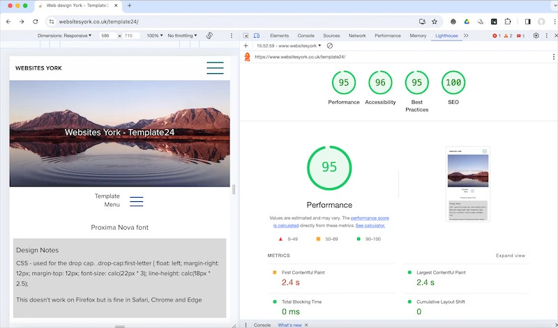
Lighthouse Scores
Animated SVG from Loaf